After five years, The Hundred’s identity remains unclear

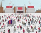
After five years of the competition, questions persist about what The Hundred actually represents. The Manchester Super Giants’ adoption of the Lucknow Super Giants’ colours at Lord’s and a bungled social media reveal in June underlined how manufactured identity has become part of the tournament’s story.
The tournament has often felt like an exercise in deliberate branding rather than organic tradition. The Lucknow Super Giants kit, the organisers say, draws from the “cultural fabric” of the city and the surrounding state of Uttar Pradesh, “where colour, craft and ritual shape everyday life”. According to the team website, the shirt-and-trousers combo signals “ambition grounded in responsibility to the city it represents”, and reflects “resilience under pressure, steady progress and the confidence that comes from building the right way”. It is striking how much narrative is attached to a simple red-and-blue stripe design.
There are direct links between franchise identities across continents. Justin Langer, who coached the team through this season’s Indian Premier League, has a visible connection to the Super Giant name, and the Manchester men’s squad pulled on the exact same colours (including the elephant on the club crest) before their Hundred debut at Lord’s. That visual continuity extends beyond kits: Aiden Markram – captain, now, of all three team Super Giant franchises – was captured in the pre-match huddle tugging at his shirt as if to underline a shared identity.
The Manchester launch amplified the sense that styling and storytelling are being manufactured to create instant heritage. A social media campaign in June that attempted to reframe the palette for a northern English audience was widely noted for its awkwardness. The colours are now said to represent the perfect summertime union of the northern city’s warring footballing tribes, a phrase that illustrates how marketing has been handed the task of reconciling disparate local loyalties.
That transfer of motifs across leagues and markets raises practical questions about ownership of symbolism. A crest element such as an elephant, meaningful in the Indian context, takes on different connotations when applied to a Manchester-based franchise. The repetition of names and designs across the Super Giant franchises makes it difficult to tell whether fans are being invited into a common narrative or a series of interchangeable brand exercises.
Each of the details — the quoted design statements, the coaching links, the captaincy overlap, and the contested social launch — contributes to a broader impression of The Hundred as a project of constructed identity. Whether that construction will settle into something genuinely embraced by supporters remains an open matter of perception.
For now, the sequence of launches and borrowed imagery leaves the competition’s character unresolved, with symbolic gestures more prominent than any settled traditions.